30 October 2010

The Shoppe and a Giveaway!

***Please scroll to the bottom for info on the giveaway!***


So, dear friends, I have finally opened a Shoppe. As many of you have been telling me to do for quite awhile. :)

Shealynn's Faerie Shoppe is dedicated towards making fun, unique, and quality items. I specialize in chainmaille, fantasy, and religious jewelry.

But I certainly don't limit myself to that! You'll find an assortment of very random things on my Shoppe, just like you have on my blog. :)

By the way, I absolutely love custom orders. Have you seen something on my blog that you really want? If I've made it before, I can make it again. Have an idea in your head and want to see it come to fruition? Let me know! I love to experiment and make things, but I can't justify spending the money on supplies for every whim of mine-- I need an excuse. :)


 Here are some pictures from my first "batch" of jewelries. 
(Not all have been uploaded to the Shoppe yet, and some are for giveaways).


~~~~~~~~~~~~~~~~

What does this mean for the blog?

Don't worry. I won't spam you with a new post every time that I list a new item. Once a month I'll include a collage of the various things I have for sale on my Shoppe (see the picture at the beginning of this post).

In the past, I made a new post or two for every item I made. Now that I have a shop and have a "reason" for making a million jewelries... I won't do that.

Every time that I come up with a new design or a great spin on a previous one, I'll make a new post. But if I'm simply making more of the same design, I'll edit the post about that design and make a "gallery" of that design. I'll be sure to let you know when I update posts.

I'm not going to be stingy about how I do what I do. Keep an eye out for new tutorials, tips, and tricks.

And, as always, I'll keep you updated on non-Shoppe projects and hopefully give you lots of inspiration.

(Of course, the start of the Shoppe heralded a new look here at the blog. I hope you enjoy it and have fun with all the new features!)

~~~~~~~~~~~~~~~~
And now... what you've all been waiting for...

The Giveaway!
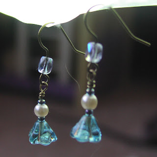
In honor of the start of my shop, I am giving away this lovely pair of earrings:


TO ENTER, please leave a comment on my blog post, telling me what you like best about my blog or Shoppe, along with any comments or suggestions. 1 entry, mandatory.

For additional entries:
  • Follow the blog. 1 entry.
  • Fan Shealynn's Faerie Shoppe on Facebook. 1 entry.
  • Post about my Shoppe, blog, and/or this giveaway on your own blog. 2 entries.
Please be sure to leave a seperate comment for each entry, or they will not be counted.


The giveaway deadline is November 10th.

21 October 2010

Autumn Whispers

I normally don't put my photography on my blog (aside from craft photos), but Hannah over at Aspire is having a photo challenge: Falling in Love with Autumn.

She inspired me to take my camera outside this morning... and the rest is history.

Even though few of our trees are colorful, our yard yeilded a plethora of photo ops! I've also included a couple pictures taken at the pumpkin patch Saturday and a few I took on a late September evening. Technically the first photo is going to be my entry. But I'm including all of these because I thought you might enjoy them!


~~~~~~~~~~~~~~~~~~~~~~~~~~~~~~~~~~~~~~

Aspire Photo Challenge

18 October 2010

Teaser!


TEASER! This has got something to do with the news I mentioned in my last post.

If you look at my header, you'll see that the fairy is a handdrawn sketch that I scanned in and slapped some Paint Shop effects on.

The fairy at the top of this post is a completely computer-drawn vector image! I spent a few good hours learning the basics of Adobe Illustrator and coming up with this fairy illustration.

Click to enlarge.

  1. Here you can see what I started out with-- some basic "flow lines" and shapes to guide me. These got erased as I continued working. 
  2. In this second shot, you can start to see the buildup of shapes that replaced the line drawing. Notice how much different the head shape is-- I had to fix each line and curve! Behind the head are some squiggly lines that, when shrunk, became curls.
  3. We're getting somewhere, finally! I built up the main body shape and turned everything black. I added more detail and fixed the wing shape.
  4. The original silhouette. Notie the curls, book, feather, and FEET. Oh my, drawing feet on the computer is just as hard as drawing feet in real life. I shall never be able to escape the terribleness of drawing feet. :( The feather was very easy-- I just took the feather I built for my Masquerade Graphic and edited it a bit.
  5. Mom said that the fairy's bottom looked big... lol... so I changed the skirt's flow. Voila!


Can anyone guess what this fairy is for?  


 Also, I'm changing up the blog's look a bit  a lot!

13 October 2010

Exciting News Coming!


Guess what?!

Oh, wait, you already guessed it. There is exciting news coming for Shealynn's Faerie Shoppe! I wonder how you figured that out? I'd really like to borrow some of your mind-reading powers!

I'll only keep you on tenterhooks for a week... 


In the meantime, please check out my previous post and VOTE on what YOU want to see here at the Shoppe!

11 October 2010

Shabby Apple Dress Design Entry

Dress design for Shabby Apple dresses.

by: Shaylynn Rackers

A friend told me about this contest awhile ago; I'd completely forgotten about it until I saw the contest mentioned on a blog. I knew I had to enter, it would be too much fun.
This contest is by Shabby Apple. They make some über cute dresses. ^_^


Here is my Spring-inspired dress!

The Front of the dress!
      When I think of spring, the first images that pop into my head are the bright colors splattering the earth and kids playfully romping in the yard. My little sister with a ruffly dress dancing in the grass; my brothers barefoot in the mud.

     This dress is bright, bold, and playful, just like springtime. It's the sort of dress that makes you feel bright and chipper and pretty.

The back
This dress is flattering on any body shape, especially the hourglass and pear. The asymmetrical hemlines and color blocks pull the eye away from any "problem areas" and focuses on a slimmer, taller line. (Don't we all want that? lol!)

The contrasting waistline brings the waist into focus, something which ladies with pear and hourglass figures will love! However, it is not a problem for those with flat waists, either.

I've included gathers on the front bodice and the waistband. I've noticed that just a few gathers in the right places make one look just a little slimmer.

There are no cap sleeves. Instead, the sleeves are looser and longer, a boon for any woman with a larger arm.

The dress has a good neckline, hemline to the knees, and draws attention to the face.

And, of course, the timeless A-line shape is flattering on anyone.


I love ruffles, but so often you find them in overabundance. In this design I toned them down-- they are still there in all their glory, but a little more grown-up in the sparseness.

And then COLOR! Color is so bold and playful and jazzes up anything! In my drawings, I experimented with several different color combinations. The monochromatic green, shown in the very first image of this post, is my favorite and my "official" entry. This dress could easily be done in so many other ways. The darker shade could be on either the contrasting ruffles, or on the "wrap" part of the dress. The color can fade in shade, as seen in the "pink" drawing. Two or even three colors could be used. This dress could be made in monotone for a more sophisticated look!

[IMAGE]


Fabric
I checked the tag on a dress with material similar to what I was imagining- it was 95% polyester with some cotton and spandex. The fabric shouldn't have a sheen to it and should lay nicely, especially along the gathers.


Inspiration
The entry guidelines at Shabby Apple ask for design inspiration. Frankly, I didn't have anything in mind except general "springiness. " ^_^ I imagined a dress, sketched it out a few times, and finally decided that "Yes, this is something that I would wear!"

However, I can pick out a few things that inspired this dress-- or rather, things that inspire my imagination. 


The bright colors so popular in the European styles that I've seen.

The classic A-line dress, and RUFFLES!


And, of course, SPRING! 

And I might even go so far as to say that the top, with the front panel that crosses over, was inspired by a beautiful Indian sari that a woman at Wal-Mart was wearing!


I'm working on a fun drawing right now with a girl wearing this dress. :)

10 October 2010

A Medley of Chainmaille

Some of the stuff littering my room...
Chainmaille is addicting. I never knew just how fateful that one day at the Summerfest would be. I saw UnkamenGifts, and was immediately hooked.

I've been working hard on some new chainmaille items. Shown here is most of what I have made (that I still have; I've made and given more!). 

Click to enlarge the image. Which is your favorite? Leave a comment!!!

PSST! I've discovered the secret to getting a good picture of chainmaille!
It's called a scanner. While, as an artist, a scanner is very annoying, it is a lifesaver in the way of chainmaille. Of course, the scans are not very artsy, but boy do they show detail! I'm sitting here grimacing at all the pliers' marks and the half-shut rings.

05 October 2010

Escaping Marble


This little fella sure lived up to it's name. Let me explain...

Once upon a time...


     I spent a very long time trying to make this captured marble. I'm pretty sure it hated me. I used a random assortment of rings, all quite munchkin-ier than the rings I used for the Truly Captured Marble.

     The rings were much smaller, which let me make a "window" in the front-- while securely held, the marble was able to move. Whenever I wore it, I couldn't stop fiddling with it. The marble moved. Thus it was named "Escaping Marble." It never really escaped. It only tried to. As I said, it moved. 

     Thus it was doomed to half-escape and moving for a whole month.

     Then I wore the necklace to a dance, got it tangled in my hair, and instead of doing the rational thing and going to the bathroom to untangle it, I yanked really hard. And broke it. Go figure. And now I can't get it back together. Go figure.

And so the marble truly escaped.

The End.

(Thankfully I snapped some pictures before the necklace was doomed to the painful death of yanking.)

In all its pre-yanking glory.

Escaping marble, Captured Marble, and a little trapped bead.

03 October 2010

Masquerade Graphics

I made these graphics for my Masquerade party! I used the amazing Adobe Illustrator CS5 software.
It all began as a pen and ink sketch of two mask. I then scanned in the page from my sketchbook.
After a few hours of tinkering around and learning the software, I finished it. Fully vectorized, colorized graphics!


*Please note that I am keeping the graphics at a low resolution for safety reason. I'll be doing this to many of my graphics from now on. It's not too small-- I wanted you to be able to see it, but clicking to enlarge will not enlarge by very much.

See also:
My Other Masquerade Posts (scroll down)

  • bgbgb