Showing posts with label graphic art. Show all posts

05 April 2012

"Children of Lir" Linoblock

The Swan Children of Lir ~ Linoblock by ShaylynnAnn

This March, we did the an awesome project in art class. It's called linoleum block printing, and was truly something different-- you essentially carve your own stamp into a very graphic piece of art. It was ubiquitous in the old days, before computers and printers, and was favored  by graphic designers. (I was extremely delighted to learn that M.C. Escher-- my favorite artist-mathematician-- made linoblocks, along with woodcuts and various other kinds of "mechanical graphic art".)

These days, it's an antiquated technique. No longer do you need stamps to create multiple copies of artwork. We now have cameras and computers. It's no longer used by graphic artists and designers, because we have things like Photoshop and Illustrator and InDesign. I love those softwares, and I love computers, and I love cameras, and I'm a bit of a technology geek, but it makes me sad that linoleum blocks have been regulated to historical art classes.

The watercolor I based the print off of.

I don't know how much I've said about my art class, but a local artist teaches classes in her basement. I had found information about a linoleum block contest (no, I didn't place) and brought it to her to ask about it, since I'd never heard of the technique. Turns out, she did some in college and  was great enough to get us the supplies and teach us how to do it.

The day that we decided to start this project, I had no idea what I wanted to do. So I pulled out the 30 Day Drawing Challenge notebook and grabbed my favorite watercolor from it (see above). Yeah, it was pretty hard to come up with an 8X10 black-and-white design based off of a 4X6 watercolor... But I managed to get the entire drawing done in an hour. I transferred it to the linoleum block by coloring the back of the drawing with a pencil and transferring the graphite.

The picture is an illustration of the Swan Children of Lir. It's a beautiful and haunting Irish fairytale... I wrote about it here and included links to various telling of the tale.


Since I think linoblock printing is so cool, I want to share some insight on this technique...
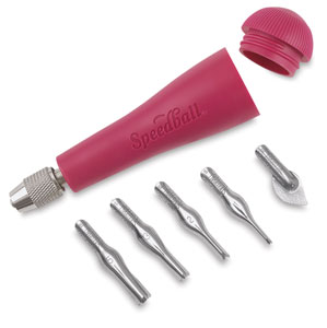


Picture from Dick Blick
The above is a picture of the tool that I used to carve my block in class. It's specially designed with all sorts of tips (that were way to big for all the details I used).


The above are pictures of the tools that I actually used. I brought the block home to work on in all that free time that I have, but there weren't linoblock tools to spare. I took this opportunity to draw all over the photograph with my Wacom tablet, but here's a text translation of my tools:


  • Linoluem block. A sheet of linoleum mounted on a block of wood.
  • X-acto knife. I can't image doing a linoblock without a scapel knife. I used it extensively for the lines in the water-- each line   (yes, each and every individual bajillion lines-- I'm crazy and obsessed with art) was outlined by two angled cuts with the xacto and then "popped out" with...
  • Screwdrivers. You use what you have! And in my case, I had a case of flathead screwdrivers in a variety of sizes. For small and medium-sized areas, I traced the shape deeply with the xacto knife, then slid the screwdriver underneath and "popped" the linoleum out. I also didn't like the way that the cut-outs were really rough (especially when I used the "real" tools), so I used the screwdrivers to burnish the cut linoleum. I am crazy.
  • Hair dryer. Great substitute for a heat gun. I used it to warm up the linoleum to make it easier to cut (but gave up on it because it took so long-- no easy cutting for me, because I'm too impatient, lol!)
  • Horsehair brush. Remember the box of old drafting tools I found this in? Super useful for brushing out bits of obstinate linoleum.
  • The drawing. 
  • A phone. To talk to a friend to while I slaved away, duh.
  • Book pages. Yup, those are the very book pages that went into the book page skirt.
  • Not pictured-- glue. Elmer's works. Because sometimes, you accidently cut out things like eyes because they are so tiny...
  • Also not pictured-- trash can. I tell you, the carvings pile up!


A closeup of the detail.


My favorite part was probably the problem-solving... it really takes a lot of thinking. You don't only have to worry about whether the art is good, whether it tells a story, whether the proportions are right... you also have to try and "shade" in just black and white, "think backwards" (because you are "drawing"-- that is, carving-- the negative space), figure out how to leave the right spaces uncut, AND pay attention to the fact that the entire image will be reversed when you are done!


This is the only in-focus picture I got of  the printing process.

It was fairly simple...

  1. Get good, thin paper. My teacher bought special printing paper that cost a dollar a page... it didn't work very well. You know what worked the best? Some kind of thin, newspaper-like (with some of the texture of rice paper) that my grandma gave me. The edges were yellowed with age and the cover of it said "79 cents". It's from a local store that went out of business ages ago.
  2. Spread printing ink out and rub it with a brayer. The printing ink is a gel-like substance. You have to rub it until it makes just the right tone of "squeek squalsh squish" noises.
  3. Transfer the ink to the block. It's harder than it appears. You can't have too much ink (it fills in the holes) and you can't have too little. You have to cover the whole thing in layers. And I found that it's best to roll the brayer (both in the ink and on the block) in the same direction. It keeps the ink from gridlocking. At least that's my theory. But it does help.
  4. Press the block to the paper. Believe it or not, our little press did barely anything. No help, really. You have to get gung-ho and use ELBOW GREASE, and a LOT of it. Use something flat and push and rub and kill your arm!
  5. Clean the block every 2-3 prints. Easy but messy if you use water-based ink.


I pulled 14 prints in all. Some had too little ink, some had too much, the first few had bad ink (old stuff that was too dry), most of them didn't completely transfer the large area in the sky, etc. It took 7 prints before I pulled a really good one. 

The best part? Lifting the paper up, seeing a good print peel from the block, smelling the wet ink...

I know that this whole things sounds time-consuming and difficult-- and it might sound like I'm complaining. I'm not. I quite inexplicably LOVE linoblocks. LOVE LOVE LOVE. They are AWESOME. It's such a different technique, I've never done anything like it before. I hope to do more-- when I have time. Because it is time-consuming.

One last note-- is it just me or does my Irish fairytale illustration look a little Japanese? It must be the lines in the water.I just did some googling, and it turns out that technique is often used in Japanese woodcuts (another thing I'd like to try).


WELL, I just wrote a book. (fellow geeks, I just thought that sentence in the accent of the 10th Doctor).
 Hope you don't mind my rambling!

03 April 2012

The REAL Mythology Issue

HAPPY APRIL FOOL'S!

I love the comments you all left on the "April Issue of Ink and Fairydust" and the notes we got on facebook-- I think we tricked every one of you!

Is it bad if I let you know that the main reason I made the fake issue was to gain a few days' grace time? I meant it when I said that I was behind in graphics work. :) 

(Reading every article, pondering what colors and styles would go with it, organizing the illustrators and photographer, finding public domain photos with high enough resolution, brainstorming new layout designs, and stitching all of that together into a 38 page long PDF... it's like working a part time job! Not that I am complaining-- I'm not! I love doing this!-- but for some reason I feel like I have to justify why I took so long. As if you were staring at me with angry eyes, asking why is this issue late?)

 Of course, I was also strongly motivated by my gleeful maniacal laugh-- MUAHAHAHAHA!-- because I do seriously love little pranks and big goofiness.

And it was great. I've been maniacal-laughing like crazy. First, I tricked all the other editors by sending them an email asking them to please review the final draft for typos. That caught every one of them. :)

I hope you guys caught all the strange references that got tossed into small corners of the magazine-- for instance, Gandalf wrote an article, the Fairy Godmother wants cough drops, and I taught you guys the definition of haplology!

Now for the REAL March/April issue of I&F!

The theme? Mythology! We have a very interesting mix of articles (not the kinds you would expect for a mythology-themed issue-- our writers surprised me very much with some insightful and out-of-the-box articles),  a lovely short story, and much, much more.


As always, I'm going to remind you that I&F is entirely run by teens and young adults like myself, who volunteer many, many hours to put this publication together.

Since we offer it for free, we don't have any money for advertising. You can help by sharing each issue with your friends and family-- post it on facebook, embed it on your blog (there is an embed link under the magazine on our Issuu page, here), email the link, etc. Email us at ask@inkandfairydust.com and tell us what you think about each issue. Tell us how we can improve, and feed our egos by telling us how much you love it. :) lol!

My mom recently complained that it is hard to read I&F on her iPhone, but she doesn't like reading on a vertical computer screen. Unfortunately, the website that we use to host our giant files, Issuu, is not full compatible with mobile devices. However, if you make a free account with Issuu, you can download the full PDFs for each I&F issue and read it at your leisure on iPads, Kindles, and more-- you can even print it out. (We can't offer a print version at the moment because we would have to charge for subscriptions and do all sorts of legal stuff regarding the money.) We're looking for a way to post the PDFs directly onto our website for download without taking up all our server space (which is being graciously donated by Veraprise Inc.)


Oh, don't forget to check out page 18 for the information on our first fiction contest! (I'll post a JPEG of that in a couple of days so you can print it out and share it with your friends and family-- we want lots of entries!)

28 March 2011

Digital Coloring { Guest Post }


I'm am so excited to introduce Elenatintil! You've probably heard me talk about her before. Although I haven't met her in person (yet), she has been a huge inspiration in my life! She runs the Fairy Tale Forum, edits and produces I&F, directed the Shadow of the Bear-- The Movie, helped get me started on the whole writing-is-actually-really-really-fun, and more.

Elena is a wonderful artist, and I've been amazed by her coloring skills. Today she is sharing a tutorial on digital coloring. You don't have to buy a fancy software-- Elena uses GIMP, which you can download for free here.

_____________________
 
Elenatintil is a writer, artist, and costumer who regularly blogs on art, film, books and life at www.elenatintil.blogspot.com. She also is an occasionally ambitious filmmaker, whose latest project is a feature length film based on Regina Doman's "The Shadow of the Bear." You can find out more about the film by going to www.theshadowofthebear.blogspot.com. In her spare time Elena writes for and produces the (FREE!) e-magazine "Ink and Fairydust" under the name "Elizabeth Hausladen." You can read back issues and more about about the magazine at www.inkandfairydust.com.
 
_____________________


   Have you ever wondered how to color a picture on the computer? Believe it or not, digital coloring is fast becoming one of the primary color mediums for artists today. Nearly all comic books are colored digitally, and most fan creations feature the medium as well.

    I really enjoy digital coloring. It's a flexible, forgiving medium that can be easily reproduced, shared or tweaked, and you can get started for free. I use the software GIMP (which this tutorial will be using), which is a free online software that functions like a slightly less sophisticated version of Photoshop.

  You can also color using a mouse (I actually got started using my laptop touchpad!), but if you really get into it, I highly recommend investing in a digital drawing tablet. Top of the line is a Wacom, of which I have the Wacom Bamboo Pen. At $70 it's a good price-range for a Christmas or birthday gift.


So, lets get started, shall we?

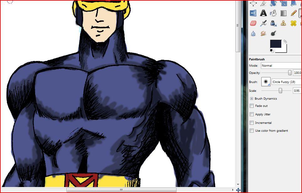
For this picture I will be using an inked sketch of X-Men leader Cyclops. Comic book art these days has gotten so good that it's worth studying for the technique alone. It's also the perfect platform for digital drawing.


#1 – Open your black and white inked drawing into GIMP (or the software of your choice).


#2 – Under the inked layer, add another layer of pure white. Then, set the inked layer to “multiply” (as shown in the photo below). Multiple automatically makes all white pixels transparent, so that any coloring you do underneath the inked layer will show through everything except the black lines.


#3 – Then, between the inked layer and the white bottom layer, insert a transparency layer (as shown below). You will need one transparency layer for every main color involved in your drawing. In this picture, there are four main colors (skin tone, blue, yellow and red), thus I will need four transparencies.


#4 – First off is to lay down flat color. Flat color is a single tone, with no high lights or lowlights. I start with the skin layer, and work my way upwards through the clothing layers – skin, blue, yellow and finally red.


To lay down flat color, I chose a solid brush and color close to the lines, but it's okay if I go a little over – I'll fix it with my eraser later.

#5 – I repeat this step with each layer until I've laid down all the flat color for the entire figure.


#6 – now it is time to add highlights and lowlights! To do this, I start with the top layer. The reds dont' need much, so I'm going to demonstrate with the blue uniform. First off I use my color picker tool (pictured below) to select the blue tone.


#7 – I then open up my color palette (pictured below) and select a shade of blue slightly darker than my flat tone.

#8 – using a feathered brush (pictured below) I paint in the shadows.


#9 – for added depth, I repeat the last few steps with an even darker shade of blue, coloring a smaller portion of the shadows. This creates dimension.


#10 – time for highlights! Highlights are created the same way as lowlights/shadows, but using progressively lighter shades. Highlights should go on the protrusions that would be well lit, using pure white to create the shinest effects.


#11 – time to polish things up! I take my smudge tool and blend the edges together, creating a smooth, almost painted effect.


#12 – After adding highlights and shadows to all of my layers, I decided that Cyclop's face was too pale for such a man of action. So I opened up my curves graph and adjust the dark and light values.


#13 – this still isn't a rich enough tone, so I head over to my hue/satuation options and up the satuation a bit.


#14 – now it's time to add a background! (I add backgrounds before doing the final erasing because it is easier to see the edges this way.) To create a background, I add another layer below all the transparencies, but just above the bottom white layer. For Cyclop's background, I decide to go with black, and jazz it up with a few brushes in the same colors as his uniform.


#15 – next I go through all the layers (starting with the top) and erase any sloppy edges. I then merge all the layers together and save the image as a new file (so that my layers are still available if I want to make changes later on).


#16 – I'm not entirely happy with the colors yet, so I make a copy of the picture. I then use the colorize function to turn the top layer blue. I lower the opacity of the blue to about 34% so that most of the original color still shows through.


#17 – now the colors are a bit too cool – I want some more warmth. So I repeat this step with red and yellow layers. Now things are looking snazzy...


#18 – I adjust the curves and saturation one last time and voila! I have a completed picture!

07 December 2010

Wordle Word Cloud

"Shealynn's Faerie Shoppe" word cloud
I love typography. Words themselves are so beautiful; they are an art of ideas, and can be an art in themselves.


Maybe that is why I love calligraphy. Even without the fancy pens... I tend to add swirls or lengthen lines or change the shapes of many letters. (although I will NOT claim that my ordinary handwriting is very pretty). And on the computer... Oh, so fun! I love downloading fonts and creating typography. It's amazing what a little difference can do to impact the visual presentation and the "theme" of a word!

I've found a really neat website, called { Wordle } which lets you make word clouds and edit all sorts of settings. It's about 100X faster than making a typography cloud yourself, and you still gets lots of customization!


Wordle lets you manually choose words, as I did in the first picture. I ran the image through Photoshop to make it focus on the words "Shealynn's Faerie Shoppe".  You can type words multiple times, and they will appear larger than other words.

I tried this for an essay-- copy and paste into Wordle's magic box. The result was much prettier than the essay :)
Click to enlarge

Wordle can make clouds based on websites! Here, you can see the most frequent words used on this blog, all on a pretty little word cloud!
Click to enlarge
Here it is again-- but with different settings.

Click to... you get the picture
Even my { ArtFire shoppe } can be made into a Wordle. I had no idea that my most-used word was "SOMETHING"!!! Haha! The Shoppe is full of lots of "somethings!"


This is a quick typography project for anyone! You could do so much with it... I might print one out and slide in a school binder; what do you think?

18 October 2010

Teaser!


TEASER! This has got something to do with the news I mentioned in my last post.

If you look at my header, you'll see that the fairy is a handdrawn sketch that I scanned in and slapped some Paint Shop effects on.

The fairy at the top of this post is a completely computer-drawn vector image! I spent a few good hours learning the basics of Adobe Illustrator and coming up with this fairy illustration.

Click to enlarge.

  1. Here you can see what I started out with-- some basic "flow lines" and shapes to guide me. These got erased as I continued working. 
  2. In this second shot, you can start to see the buildup of shapes that replaced the line drawing. Notice how much different the head shape is-- I had to fix each line and curve! Behind the head are some squiggly lines that, when shrunk, became curls.
  3. We're getting somewhere, finally! I built up the main body shape and turned everything black. I added more detail and fixed the wing shape.
  4. The original silhouette. Notie the curls, book, feather, and FEET. Oh my, drawing feet on the computer is just as hard as drawing feet in real life. I shall never be able to escape the terribleness of drawing feet. :( The feather was very easy-- I just took the feather I built for my Masquerade Graphic and edited it a bit.
  5. Mom said that the fairy's bottom looked big... lol... so I changed the skirt's flow. Voila!


Can anyone guess what this fairy is for?  


 Also, I'm changing up the blog's look a bit  a lot!

03 October 2010

Masquerade Graphics

I made these graphics for my Masquerade party! I used the amazing Adobe Illustrator CS5 software.
It all began as a pen and ink sketch of two mask. I then scanned in the page from my sketchbook.
After a few hours of tinkering around and learning the software, I finished it. Fully vectorized, colorized graphics!


*Please note that I am keeping the graphics at a low resolution for safety reason. I'll be doing this to many of my graphics from now on. It's not too small-- I wanted you to be able to see it, but clicking to enlarge will not enlarge by very much.

See also:
My Other Masquerade Posts (scroll down)

20 September 2010

Ink and Fairydust Website

Hello, everyone! I have exciting news! I have designed my very first website!


Ink and Fairydust is the free online magazine that I work for (monthly comic and column, some articles, and some graphic design-- and now website design!).

I made the website from scratch using Adobe Dreamweaver, which I have been using for a whole five days. I love teaching myself new software...

It is still very basic and I haven't added any extra content yet. I still have alot to learn on Dreamweaver. . I'll be updating the website over time!

Please bookmark the site! We have a new issue coming out on October 1st!

14 September 2010

Timeless Tale


This is my entry for the "Belle Fashion Event." It is not fashion... I'm entering the Art category!

I made it on Adobe Illustrator, while trying out a new technique.

It's not as finished as I would like-- I might go back and fix it up after I've finished the illustrations for Pen in the Clouds.


EDIT: I won! O.o Thank you to Hannah for hosting this event!

31 July 2010

Logo Idea

I'm interrupting your regularly scheduled posts with a logo idea.

I'm getting bored of my current header, and am considering making the blog background a little cleaner (but with the same picture).

Here's what I messed around with while teaching myself how to use Adobe Illustrator CS5:

Its obviously not finished. I wanted opinions, though! What do you think? Be as harsh as you want, and as creative with your ideas as you want.

I might try putting some pictures of stuff featured on this blog inside those rectangles, instead of the random-but-fun one I've got in there now.

15 September 2009

More Backgrounds

Here are more backgrounds (or rather, several variations on the same one) that anyone can use. Look at my earlier post to see how to use these.


13 September 2009

Computer Graphics

You may have noticed a fancy new background and header on this blog. :) The header was made with a scan of one of my drawings, and was edited with Paint Shop. I am going to give instructions on how to make your own...


Header: (that things up on the top with my blog's name).
  1. Using Paint Shop, Photoshop, gimp, picknik, or even the Paint that comes for free on Windows, create an image in a 1:2 ratio.(I used Paint Shop Pro, layering a scan of my drawing, background textures, and text. I got the font from this site)
  2. Save as .jpg
  3. Open up Blogger Dashboard. Click your blog. Click Layout. On the top there should be a Header option. Click Edit. Upload your photo, choose "instead of title and description" and "shrink to fit". Save.
Tah-dah! You have made your very own header for your blog!
Background: (the fancy design you see in... you guessed it... the background).
  1.  Check out The Custest Blog on the Block's Backgrounds. They have a wide selection and easy instructions.
  2. Or, create your own (as I did). Follow these instructions. Please note: For this blog, I did not use the Minima template, but the Scribe template. If you are well versed in HTML, you should be able to to tweak the code on any template. For beginners, I would suggest simply using Minima.
  3. Or, use one of mine. So far I only have one. :( I hope to make more soon.
To use mine: 

  1. Right-click above image (or the image of any background I post for use). Click "view image". Right-click on full-size image. Click "copy image location".

  2.  Next go to ‚customize, layout‚ pick a new template‚ then choose a Minima template.Then click on edit HTML‚ You will see a big, long, crazy code (that is HTML). Scroll to where you see this:


body {
background:$bgcolor;
margin:0; color:$textcolor; font:x-small Georgia Serif; font-size/* */:/**/small; font-size: /**/small; text-align: center;

Change that part of the code to say this:

body {
background:$bgcolor;background-image:url('/direct link');background-position: center; background-repeat:no-repeat; background-attachment: fixed;
margin:0; color:$textcolor; font:x-small Georgia Serif; font-size/* */:/**/small; font-size: /**/small; text-align: center; 

3. Insert the image location where it says "direct link".
4. Preview, then save

Hooray! You did it!!!

  • bgbgb