15 April 2012

Virtual Hugs

Some of you might have noticed that I published a blank post yesterday.

It wasn't supposed to be like that.

Back in January, I noticed a "New Year's" trend among bloggers, in which they shared some of the strangest keywords bringing Googlers to their blogs. I thought I would do a similar thing... yes, in April, does it matter? One evening I browsed through Google Analytics, found some hilarious things, and wasted two and a half hours of my life. Sometimes, you just really don't want to write essays.

I compiled all these things and then did some twenty speed drawings to illustrate them. I also thought that I was very punny. There were lots and lots of jokes and that strange happy-sarcastic-laughter that I specialize in when functioning on three cups of black tea.

I was very proud of that post. Oh, so very, very proud.

Yesterday, I pulled the post open on my iPod and clicked "Publish." ("Publish," in this case, is the Blogger version of BIG RED BUTTON THAT SAYS DO NOT PUSH! as you will soon see.)

After hitting publish, I clicked "View Blog," just to make sure that everything worked well and that the captions were lined up under my illustrations. The iPod took forever to load, but then I didn't mind. I was sitting at the lunch table, eating a very delicious ham, spicy cheese, and onion-dressing sandwich. All was well in the world. Until...
This is me, shocked.
There was nothing in the post. It must have been my iPod, right? I very recklessly dropped my delicious sandwich on my plate and ran downstairs. I think I stepped on my little brother's toe on the way to the computer room. I opened up my browser and...


This is me, in denial.
IT WAS GONE! Totally, completely, and utterly gone.

I posted in the Blogger Help Forums. My reaction will tell you whether I got any helpful information.

This is me, reacting.

Yeah. 


Morals of the story:


  1. It is of imperative importance that I find a way to back up Blogger posts. 
  2. I have two choices: a) forget it and move on, or, b) be stubborn and redo it
  3. Yours truly is stubborn and doesn't like having 20 unused speed drawings and will redo it. Someday. Yours truly is a very busy girl.
  4. It is a bad idea to leave a delicious sandwich on your plate and leave the lunch table. A diligent little sibling might just decide to be extra nice to you and clear your plate.
  5. Sometimes, things just go wrong and Yours Truly overreacts. It's safe to say that if I look like this:
then a virtual hug is in order. Dear lovely lovely friends who read my blog, help me chillax, please!

*deep breath*

Thank you for letting me rant.

11 April 2012

Bookish Adventures {part three}


This is the third part of the photoshoot I did with my little sister wearing a book page skirt.

{Part One}
{Part Two}

I'm also experimenting with some different editing styles (some very drastic due to weird lighting and white balance), but some of the photos are left unedited. Which is your favorite?


05 April 2012

Easter

The Last Supper by Leonardo DaVinci
Hello, everyone!

I hope you have a very blessed Triduum (the three days before Easter), and a wonderful Easter!

The Crucifixion by Diego Velazquez
Traditional icon of the Ressurection

This is just a note to let you know I won't be blogging over the next week. :) In the meantime, enjoy these wonderful pieces of art!

Also, I recently read this journal by an artist on DeviantArt. It's an absolute must-read for every Catholic artist. Read it here. The article is all about the vocation of the artist... here's just one of several epic quotes:


"We must depict Christ. I don't mean we have to just draw pictures of Him (though that's very important). We have to depict the object of human longing, or a very small glimpse of it anyway. Jesus Christ IS beauty, just assuredly as He is Truth, and Goodness. And One. It is part of His identity, of who He is. He is the most beautiful person of all time. Our lives have to be an image of that beauty, as we strive for sanctity living in "imitation of Christ". Our art must be the fruit of our own sanctity, of the divine indwelling of God within us. So we must depict the hope that is within us, we must depict the beauty of Christ, by making beautiful art.

Make good, excellent, beautiful art. A lot of modern Christian art makes a very utilitarian mistake of utilizing poor art for the sake of telling the truth of our faith. It's not authentic, it's not sincere. It's preachy: preaching is boring. It's not beautiful because it isn't sincere, and it shoots itself in the foot. You can be sure no poor work ever came out of a certain carpenter's shop in Nazareth."

~Aodhagain on DeviantArt

This article really struck me... I'm determined to go read JPII's Letter to Artists and actually slow down and appreciate it more.


And just for fun, the above picture gives a glimpse into the way that Leonardo sketched his preliminary drawings!

"Children of Lir" Linoblock

The Swan Children of Lir ~ Linoblock by ShaylynnAnn

This March, we did the an awesome project in art class. It's called linoleum block printing, and was truly something different-- you essentially carve your own stamp into a very graphic piece of art. It was ubiquitous in the old days, before computers and printers, and was favored  by graphic designers. (I was extremely delighted to learn that M.C. Escher-- my favorite artist-mathematician-- made linoblocks, along with woodcuts and various other kinds of "mechanical graphic art".)

These days, it's an antiquated technique. No longer do you need stamps to create multiple copies of artwork. We now have cameras and computers. It's no longer used by graphic artists and designers, because we have things like Photoshop and Illustrator and InDesign. I love those softwares, and I love computers, and I love cameras, and I'm a bit of a technology geek, but it makes me sad that linoleum blocks have been regulated to historical art classes.

The watercolor I based the print off of.

I don't know how much I've said about my art class, but a local artist teaches classes in her basement. I had found information about a linoleum block contest (no, I didn't place) and brought it to her to ask about it, since I'd never heard of the technique. Turns out, she did some in college and  was great enough to get us the supplies and teach us how to do it.

The day that we decided to start this project, I had no idea what I wanted to do. So I pulled out the 30 Day Drawing Challenge notebook and grabbed my favorite watercolor from it (see above). Yeah, it was pretty hard to come up with an 8X10 black-and-white design based off of a 4X6 watercolor... But I managed to get the entire drawing done in an hour. I transferred it to the linoleum block by coloring the back of the drawing with a pencil and transferring the graphite.

The picture is an illustration of the Swan Children of Lir. It's a beautiful and haunting Irish fairytale... I wrote about it here and included links to various telling of the tale.


Since I think linoblock printing is so cool, I want to share some insight on this technique...


Picture from Dick Blick
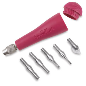
The above is a picture of the tool that I used to carve my block in class. It's specially designed with all sorts of tips (that were way to big for all the details I used).


The above are pictures of the tools that I actually used. I brought the block home to work on in all that free time that I have, but there weren't linoblock tools to spare. I took this opportunity to draw all over the photograph with my Wacom tablet, but here's a text translation of my tools:


  • Linoluem block. A sheet of linoleum mounted on a block of wood.
  • X-acto knife. I can't image doing a linoblock without a scapel knife. I used it extensively for the lines in the water-- each line   (yes, each and every individual bajillion lines-- I'm crazy and obsessed with art) was outlined by two angled cuts with the xacto and then "popped out" with...
  • Screwdrivers. You use what you have! And in my case, I had a case of flathead screwdrivers in a variety of sizes. For small and medium-sized areas, I traced the shape deeply with the xacto knife, then slid the screwdriver underneath and "popped" the linoleum out. I also didn't like the way that the cut-outs were really rough (especially when I used the "real" tools), so I used the screwdrivers to burnish the cut linoleum. I am crazy.
  • Hair dryer. Great substitute for a heat gun. I used it to warm up the linoleum to make it easier to cut (but gave up on it because it took so long-- no easy cutting for me, because I'm too impatient, lol!)
  • Horsehair brush. Remember the box of old drafting tools I found this in? Super useful for brushing out bits of obstinate linoleum.
  • The drawing. 
  • A phone. To talk to a friend to while I slaved away, duh.
  • Book pages. Yup, those are the very book pages that went into the book page skirt.
  • Not pictured-- glue. Elmer's works. Because sometimes, you accidently cut out things like eyes because they are so tiny...
  • Also not pictured-- trash can. I tell you, the carvings pile up!


A closeup of the detail.


My favorite part was probably the problem-solving... it really takes a lot of thinking. You don't only have to worry about whether the art is good, whether it tells a story, whether the proportions are right... you also have to try and "shade" in just black and white, "think backwards" (because you are "drawing"-- that is, carving-- the negative space), figure out how to leave the right spaces uncut, AND pay attention to the fact that the entire image will be reversed when you are done!


This is the only in-focus picture I got of  the printing process.

It was fairly simple...

  1. Get good, thin paper. My teacher bought special printing paper that cost a dollar a page... it didn't work very well. You know what worked the best? Some kind of thin, newspaper-like (with some of the texture of rice paper) that my grandma gave me. The edges were yellowed with age and the cover of it said "79 cents". It's from a local store that went out of business ages ago.
  2. Spread printing ink out and rub it with a brayer. The printing ink is a gel-like substance. You have to rub it until it makes just the right tone of "squeek squalsh squish" noises.
  3. Transfer the ink to the block. It's harder than it appears. You can't have too much ink (it fills in the holes) and you can't have too little. You have to cover the whole thing in layers. And I found that it's best to roll the brayer (both in the ink and on the block) in the same direction. It keeps the ink from gridlocking. At least that's my theory. But it does help.
  4. Press the block to the paper. Believe it or not, our little press did barely anything. No help, really. You have to get gung-ho and use ELBOW GREASE, and a LOT of it. Use something flat and push and rub and kill your arm!
  5. Clean the block every 2-3 prints. Easy but messy if you use water-based ink.


I pulled 14 prints in all. Some had too little ink, some had too much, the first few had bad ink (old stuff that was too dry), most of them didn't completely transfer the large area in the sky, etc. It took 7 prints before I pulled a really good one. 

The best part? Lifting the paper up, seeing a good print peel from the block, smelling the wet ink...

I know that this whole things sounds time-consuming and difficult-- and it might sound like I'm complaining. I'm not. I quite inexplicably LOVE linoblocks. LOVE LOVE LOVE. They are AWESOME. It's such a different technique, I've never done anything like it before. I hope to do more-- when I have time. Because it is time-consuming.

One last note-- is it just me or does my Irish fairytale illustration look a little Japanese? It must be the lines in the water.I just did some googling, and it turns out that technique is often used in Japanese woodcuts (another thing I'd like to try).


WELL, I just wrote a book. (fellow geeks, I just thought that sentence in the accent of the 10th Doctor).
 Hope you don't mind my rambling!

03 April 2012

The REAL Mythology Issue

HAPPY APRIL FOOL'S!

I love the comments you all left on the "April Issue of Ink and Fairydust" and the notes we got on facebook-- I think we tricked every one of you!

Is it bad if I let you know that the main reason I made the fake issue was to gain a few days' grace time? I meant it when I said that I was behind in graphics work. :) 

(Reading every article, pondering what colors and styles would go with it, organizing the illustrators and photographer, finding public domain photos with high enough resolution, brainstorming new layout designs, and stitching all of that together into a 38 page long PDF... it's like working a part time job! Not that I am complaining-- I'm not! I love doing this!-- but for some reason I feel like I have to justify why I took so long. As if you were staring at me with angry eyes, asking why is this issue late?)

 Of course, I was also strongly motivated by my gleeful maniacal laugh-- MUAHAHAHAHA!-- because I do seriously love little pranks and big goofiness.

And it was great. I've been maniacal-laughing like crazy. First, I tricked all the other editors by sending them an email asking them to please review the final draft for typos. That caught every one of them. :)

I hope you guys caught all the strange references that got tossed into small corners of the magazine-- for instance, Gandalf wrote an article, the Fairy Godmother wants cough drops, and I taught you guys the definition of haplology!

Now for the REAL March/April issue of I&F!

The theme? Mythology! We have a very interesting mix of articles (not the kinds you would expect for a mythology-themed issue-- our writers surprised me very much with some insightful and out-of-the-box articles),  a lovely short story, and much, much more.


As always, I'm going to remind you that I&F is entirely run by teens and young adults like myself, who volunteer many, many hours to put this publication together.

Since we offer it for free, we don't have any money for advertising. You can help by sharing each issue with your friends and family-- post it on facebook, embed it on your blog (there is an embed link under the magazine on our Issuu page, here), email the link, etc. Email us at ask@inkandfairydust.com and tell us what you think about each issue. Tell us how we can improve, and feed our egos by telling us how much you love it. :) lol!

My mom recently complained that it is hard to read I&F on her iPhone, but she doesn't like reading on a vertical computer screen. Unfortunately, the website that we use to host our giant files, Issuu, is not full compatible with mobile devices. However, if you make a free account with Issuu, you can download the full PDFs for each I&F issue and read it at your leisure on iPads, Kindles, and more-- you can even print it out. (We can't offer a print version at the moment because we would have to charge for subscriptions and do all sorts of legal stuff regarding the money.) We're looking for a way to post the PDFs directly onto our website for download without taking up all our server space (which is being graciously donated by Veraprise Inc.)


Oh, don't forget to check out page 18 for the information on our first fiction contest! (I'll post a JPEG of that in a couple of days so you can print it out and share it with your friends and family-- we want lots of entries!)

01 April 2012

New Issue of Ink and Fairydust

Hey, everyone! I'm in a bit of a rush as we're just about to head out the door, but I wanted to let you know that the latest issue of Ink and Fairydust is out! Many of you have anxiously been waiting for the Mythology issue (and it's my fault that it's a couple of weeks late... *big sad face* A very bad graphics editor, I am...) but hopefully this will be so wonderfully awesome that it makes up for the wait!!!


Did you like this issue? Please email ask@inkandfairydust.com to tell us! We seriously LOVE hearing feedback, it encourages us to keep working on making fun issues for you to read!

If you want to subscribe, just email subscriptions@inkandfairydust.com to be added to our email list.

  • bgbgb